
Command Alkon Website
My Contributions:
UI/UX
Website Design
Mobile Menu Design
Figma Handover
Design System
Command Alkon needed an updated corporate site that would tie together their new focus on cloud software and their veteran status in the construction industry.
I collaborated with marketing, product, and leadership to design a new site that would deliver a clean, modern layout to reflect their technology knowledge and redesigned the main menu to help users find the exact information they were searching for.
Problem
The existing website did not reflect the updated brand identity, product consolidation, and users expressed confusion when navigating the site.
Solution
Redefined the site’s primary purpose, refresh the visual design to align with the updated brand, optimized navigation with a user-first approach, and create Figma files for Dev hand-off.
Results
Launched a modern corporate website that effectively communicated the company’s cloud-based software solutions, reduced bounce rates, streamlined user-flow, and increased MQLs.
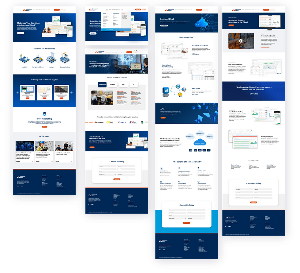
All Pages
To kick off the redesign, I focused on creating foundational page layouts that served as custom templates. These core designs were built with scalability in mind, allowing the team to easily create new pages in WordPress.
By starting with reusable sections, I gave the Command Alkon team:
-
A flexible framework we could expand as the site evolved
-
A clear, quick reference for leadership and stakeholders to understand site architecture
-
An early preview of the overall look and feel to guide page development
The high-fidelity designs helped the team visualize concepts faster, which accelerated decision-making throughout the process
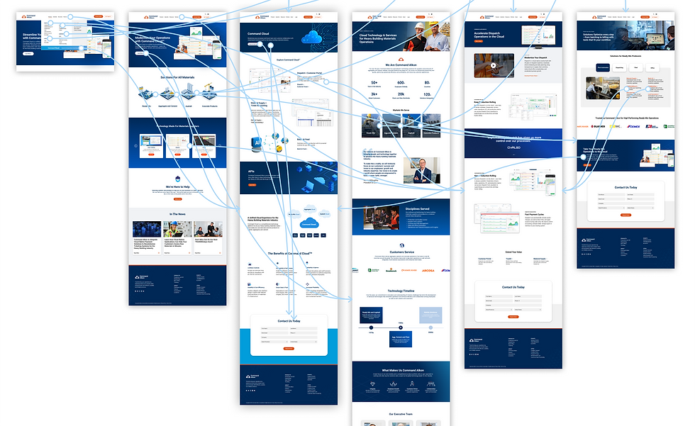
Prototyping
To help with navigation, I prototyped the basic flow from the homepage to the cloud page and through to all main product pages.
This helped the team in several ways:
-
Gave leadership a tangible view of how often users were directed back to cloud technology
-
Provided the dev team with a clear roadmap for linking structure
It also helped me better understand how users might move through the site and where we could streamline messaging.
By mapping these flows early, we set the foundation for a smoother, more intuitive user experience.
Page Navigation Before

Page Navigation Redesigned

Updating Navigation
I partnered with leadership to rethink the site’s navigation overall. We discovered that most visitors were familiar with our product names but not old suite categories we had placed them. The main feedback was our old site menu was confusing and hard to navigate.
To solve this, I proposed and designed several changes based on user and leadership feedback:
-
Products should be grouped under known industry terms
-
Single-level navigation is needed so users can see all products at once
-
Cloud platform must have a large callout as it's our main market push
This redesign we called the Mega Menu, made it easy for users to quickly find what they were looking for, streamlining their journey and improving overall usability on the site.

Mobile Menu
For mobile, I designed a navigation experience built specifically for small screens and on-the-go use. The focus was on clarity, speed, and usability:
-
Slide-style sections keep the menu compact while allowing users to quickly get to the products they care about
-
Large tap targets ensure easy navigation with thumbs, reducing accidental clicks
-
Sticky product callouts highlight our cloud solutions without overwhelming the layout
-
Streamlined hierarchy flattens layers, helping users get to products in fewer taps
The result is a mobile menu that feels lightweight but powerful, balancing simplicity with quick access to the full product catalog.


Product Pages
With a large portfolio of products offered across multiple countries, Command Alkon needed a scalable way to build consistent product pages in up to eight languages. Since most content would be added through copy and paste, simplicity and structure were critical.
I designed flexible product page templates that gave WordPress users a clear starting point.
These templates supported modular content such as:
-
Product screenshots section
-
Customer quotes section
-
Demo videos section
This approach made it easy to build pages efficiently while keeping the brand experience consistent. In the end, the team had a system that balanced efficiency with consistency across all regions.

Results
In total, I designed over 50 pages and created more than 100 custom graphics to support the refreshed site. These additional assets helped bring visual consistency to the entire experience and gave the team the tools they needed to scale the site with confidence but also helped with tangible results:
-
Increased engagement time: Session duration increased by two minutes, indicating users were finding the navigation more intuitive and content more valuable
-
Deeper exploration: Hotjar heatmaps and click-tracking showed users moving fluidly across connected product pages, signaling reduced friction in discovery
-
Improved intent signals: “Contact Us” drop-offs decreased, while direct product-specific inquiries via Salesforce forms increased
Asset Feedback
The menu is much easier to use now and see everything Command offers. There's no way to miss what you're looking for.
Product form fills are up on key products and so are views on the Command Cloud page
Tracking has shown a clean user-flow with users often clicking the correct path to an asset they need
Keep Exploring


